Our Logo
After a few years of its existence, the members of the Russian Art & Culture Group decided to create a logo. Like every symbol for any organization, our logo should catch the essence of our network while being simple and recognizable. Therefore, we asked ourselves how we may even find any images or symbols representing our broad interests, and which of them should we focus on. As a group initiated by art historians with a strong emphasis on the visual arts, we had a cornucopia of artworks as inspiration. The topics of the preceding workshops centered on Russian art from the long nineteenth century until today. But what could represent such a timeframe?
Alas, an impossible task! – Instead we chose to pick symbols representing the three focal points of the members’ scholarship: Soviet art, Russian avant-garde, and Imperial Russian art.
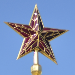
Crowning the five towers of the Moscow Kremlin since the 1930s, the red star became a symbol for Soviet Russia. Likewise, a red star embodies Soviet art in our logo.
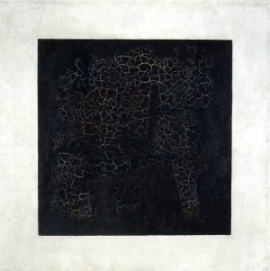
There is nothing more iconic than Kazimir Malevich’s Black Square (1915). So, the symbol for the Russian avant-garde was readily found.
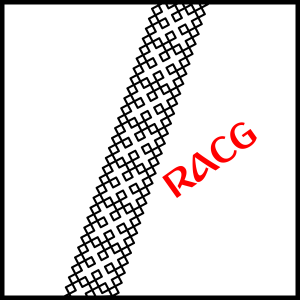
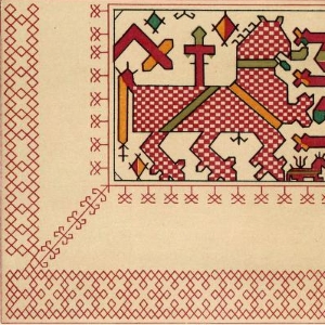
Imperial Russian art though was harder to capture. The paintings of Alexander Ivanov, Ilya Repin or Mikhail Vrubel are not easily condensed. However, one of the driving forces of the contemporary artists was the search for national elements which were found in folkloric design. Therefore, we decided to choose an embroidery pattern from Vladimir Stasov’s publication on Russian Folk Ornamentation: Embroidery, Weaving and Lace of 1872.
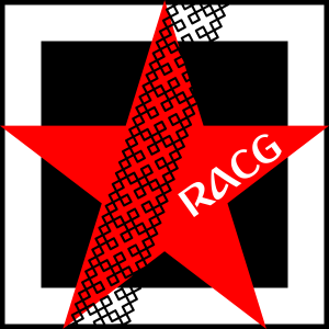
Just as the Russian Art & Culture Group unites the represented interests of international researchers, the logo fuses these symbols into one.
